Introduction to Anomaly Detection in Machine Learning
Anomaly detection algorithms have important use-cases in Data Analytics and Data Science fields. For instance, fraud analysts rely on anomaly detection algorithms to detect fraud in transactions. Another use-case of anomaly detection can be seen in Industrial IoT's streaming analytics, where IoT process engineers monitor critical process parameters to avoid anomalies in live streaming data. In data modeling, removing anomalies from the training dataset can improve the machine learning model's performance and is considered to be a vital data preprocessing step.
In this session, we will understand the common anomaly detection approaches used in industries and implement them on real datasets.
Key Takeaways from this blog
After going through this blog, we will be able to understand the following questions:
- What is an anomaly, and is it being detected?
- What are some anomaly detection methods?
- How to handle anomalies in time series?
- Industrial use-cases of anomaly detection.
- Possible interview questions on this topic.
So let's start with our first question.
What is an Anomaly?
In data science, an anomaly is referred to as an observation exhibiting abnormal behavior compared to the majority of the samples. These rare events are statistically distant, and their early identification helps in avoiding biased results in analysis. Anomaly detection applies to all univariate, bivariate, and multivariate datasets.
Why is anomaly detection important?
Let's consider an example to understand this better,
The sale of Air Conditioners spikes in summer and drops in winter. This trend is standard but supposes, unlike previous years, the sale of ACs has gone way high on a specific winter month. This kind of information is out of trend and hence, abnormal. Businesses can take advantage of such abnormal behaviors to make informed decisions in the future.
What are some famous anomaly detection techniques?
There are many types of anomalies and their detection methods. But in this article, we will be covering some famous anomaly detection methods:
- Inter Quartile Range (IQR)
- Isolation Forest
- K-Nearest Neighbours (KNN)
- Single Class SVM
Which anomaly detection technique should we pick for our data?
Anomaly detection applies to all three (univariate, bivariate, and multivariate) datasets. Various anomaly detection methods are available, and selecting the optimal approach is often determined by certain factors, like:
- Number of variables in the analysis
- Model complexity & explainability
- Type of problem (Unsupervised or Semi-supervised)
- Computation & Storage requirements
- Data-type of variables
We will evaluate each algorithm based on the above factors. Doing so will enable us taking decisions on finalizing an algorithm for the analysis based on the requirements at hand. Let's start with our first anomaly detection method.
Inter Quartile Range (IQR)
A quartile is a quantile that divides the data into four equal intervals. (0–25%, 25%-50%, 50%-75%, and 75%-100%). IQR is a statistical bound-based approach often used to detect anomalies in univariate datasets. Based on IQR, upper and lower bounds are calculated, and data lying within these bounds is considered normal and otherwise anomalies. The interquartile range is calculated as follows:
IQR = Q3 -Q1
Using the IQR, the bounds are calculated as follows:

Q1 & Q3 are the first and third quartiles in the above equation. Let's apply the IQR method for anomaly detection:
import pandas as pd

temperature = pd.read_csv('temp.csv') # temperature is a dataframe
temperature.head()
Q1 = temperature['Temperature'].quantile(0.25)
Q3 = temperature['Temperature'].quantile(0.75)

IQR = Q3 - Q1

upper_limit = Q3 + 1.5 * IQR
lower_limit = Q1 - 1.5 * IQR

anomaly = temperature[(temperature['Temperature'] > upper_limit) | (temperature['Temperature'] < lower_limit)]
print(anomaly)
We can use a boxplot for visualizing the anomalies. If you're not aware of boxplots, please visit this blog.
import numpy as np
import seaborn as sns
import matplotlib.pyplot as plt

x = temperature['Temperature']
mean = x.mean()
std = x.std()

q1, median, q3 = np.percentile(x, [25, 50, 75])
iqr = q3 - q1

fig, (ax1, ax2) = plt.subplots(nrows=2, sharex=True, figsize=(13,8))

medianprops = dict(linestyle='-', linewidth=2, color='yellow')

sns.boxplot(x=x, color='#009ACD', saturation=1, medianprops=medianprops,
            flierprops={'markerfacecolor': 'mediumseagreen'}, whis=1.5, ax=ax1)
The three dots on the right are anomalies.

Pros:
- Applicable to both univariate and multivariate datasets
- Simple and explainable
- Easy to compute
Cons:
- Not applicable to categorical variables
- Can't capture complex anomalies
Isolation Forest
Isolation forest, like the random forest, is built over decision trees. But here, we are not dealing with any labels, and hence, it is unsupervised in that sense. As the name suggests, the isolation forest algorithm creates random partitions until it isolates all the data points.
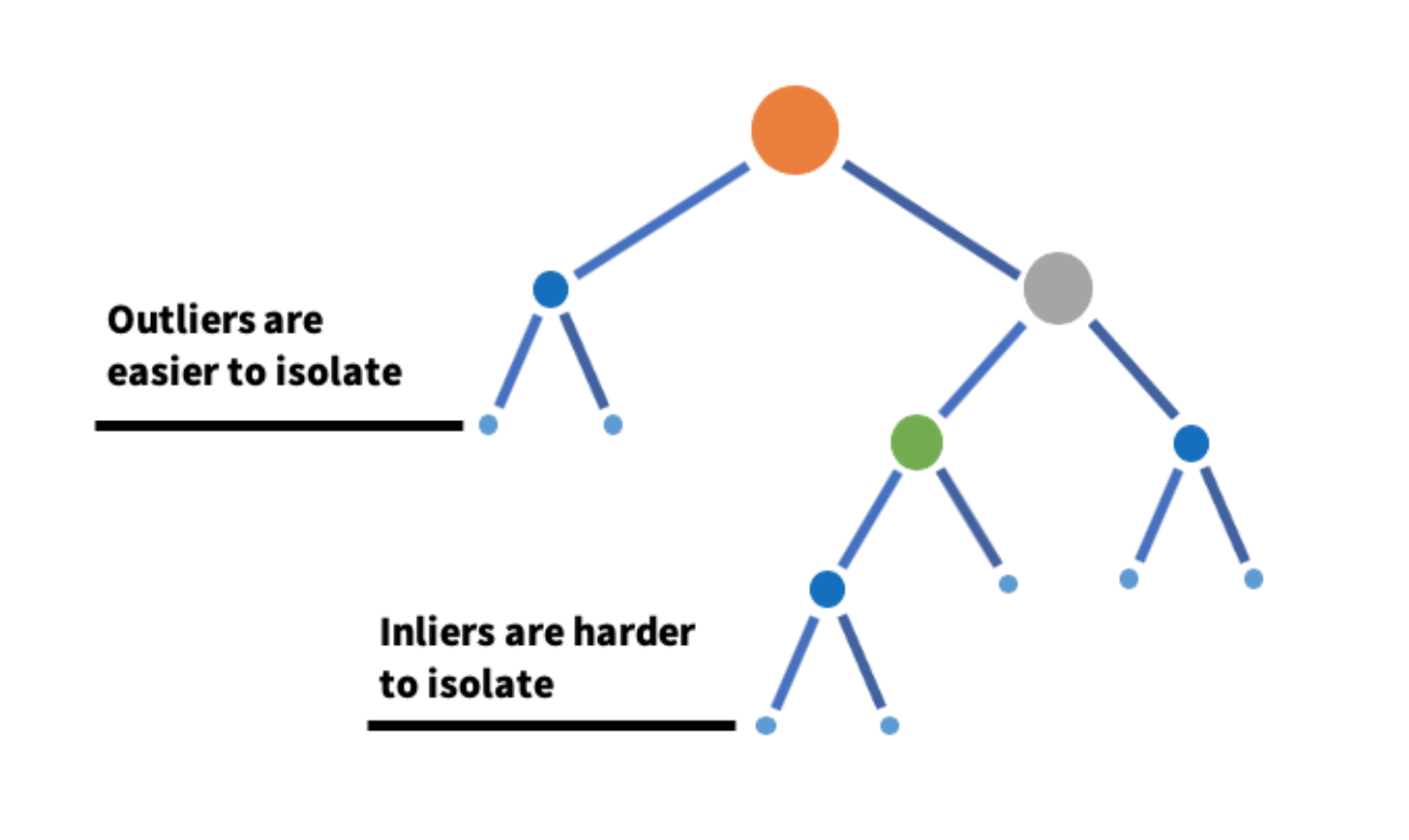
The anomalies are the ones that isolate early and easily in the tree hierarchy, while isolating a normal sample would be challenging and requires multiple partitions. The below illustration helps explain the idea.
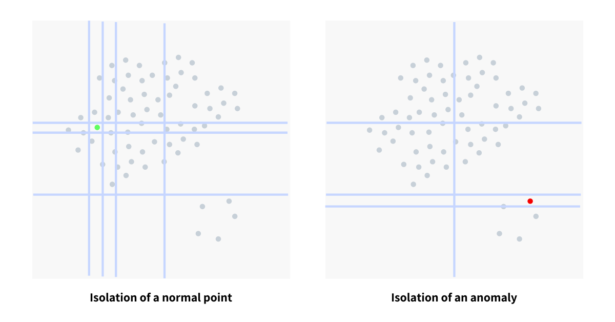
In the context of the decision tree, the anomalies lie in the top purified leaves since they isolate easily. Likewise, a standard point would require multiple partitions to isolate a point, and hence, it must lie in the bottom part of the tree.
Let's implement an Isolation Forest on a time series:
import pandas as pd
import numpy as np
import plotly.graph_objects as go
from sklearn.ensemble import IsolationForest

temperature = pd.read_csv('temp_data.csv')

model = IsolationForest(n_estimators=50, max_samples='auto', contamination=float(0.01))

temp = np.array(temperature['Average temperature']).reshape(-1, 1)

model.fit(temp)

temperature['Score'] = model.decision_function(temp)
temperature['is_anomaly'] = model.predict(temp)

anomaly_data = temperature[temperature['is_anomaly'] == -1]

fig = go.Figure([go.Scatter(x=temperature['Day'],

y=temperature['Average temperature'], name='Average Temperature')])

fig.add_trace(go.Scatter(mode="markers", x=anomaly_data["Day"], y=anomaly_data["Average temperature"], name='anomaly'))
fig.update_xaxes(title_text='Timeline')
fig.update_yaxes(title_text='Average Temperature')
fig.show()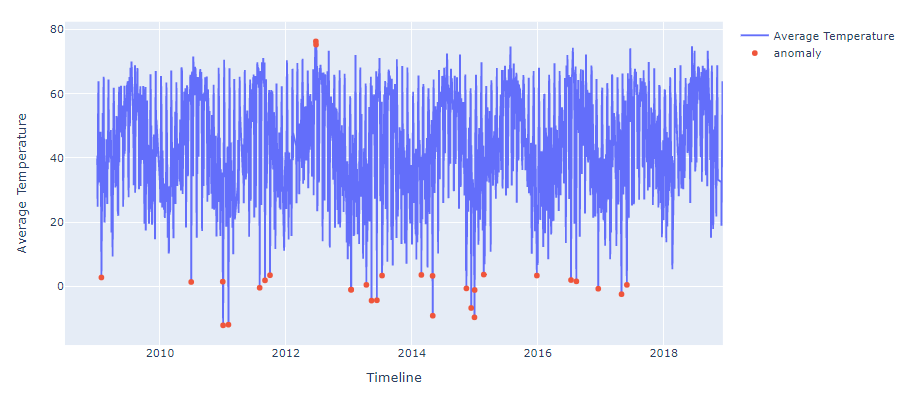
The anomalies are visible in the above time-series plot. We are looking at 1% abnormal data in the red points. Determining the threshold for declaring a point anomaly is up to us. We selected 0.01 as the contamination, picking the 1% abnormal data points from the dataset.
Pros:
- Applicable to both univariate and multivariate datasets.
- Captures complex anomalies.
Cons:
- Not applicable to categorical variables (Can try hot-encoding to apply).
- Complex & lacks explainability.
K Nearest Neighbours (KNN)
KNN is a supervised algorithm, but it is not limited to classification and regression tasks. It is also used as an anomaly detection algorithm. Please go through this blog if you're unaware of how KNN works for classification and regression.
The basic assumption behind the KNN is that similar observations are close, and anomalies are usually isolated observations. Hence, we can conclude that anomalies lie far away from the cluster. Now, if we can find the average distance of all points from each other, we might be able to identify the outliers. Since outliers are isolated observations, naturally, their average distance from other points should be high. The anomaly on the left and regular observation on the right side of the below image
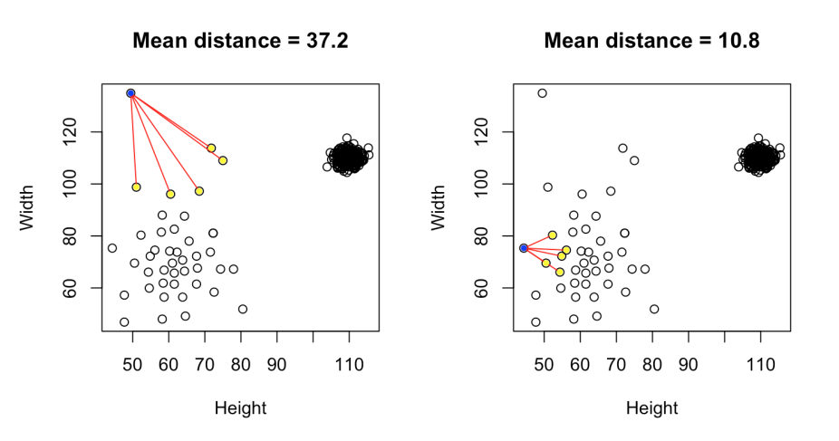
Let's implement KNN based anomaly detection technique:
import pandas as pd
import numpy as np
import plotly.express as px
from sklearn.neighbors import NearestNeighbors

data = pd.read_csv('diabetes.csv')
df = data[['Age', 'BMI']]

fig = px.scatter(df, x="Age", y="BMI")
fig.show()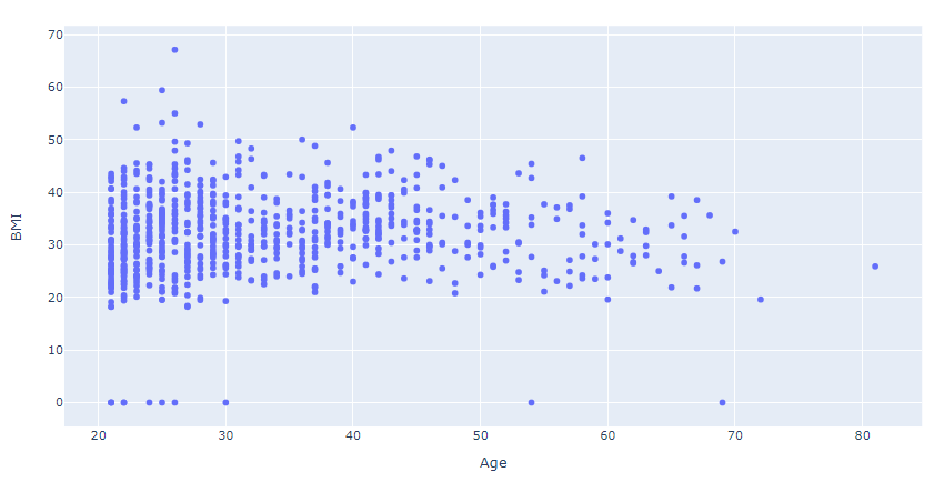
X = df.values
knn = NearestNeighbors(n_neighbors = 3)
knn.fit(X)

distances, indexes = knn.kneighbors(X)

fig = px.line(distances.mean(axis =1), title="Average Distance Plot")
fig.update_xaxes(title_text='Data Index')
fig.update_yaxes(title_text='Average Distance')
fig.show()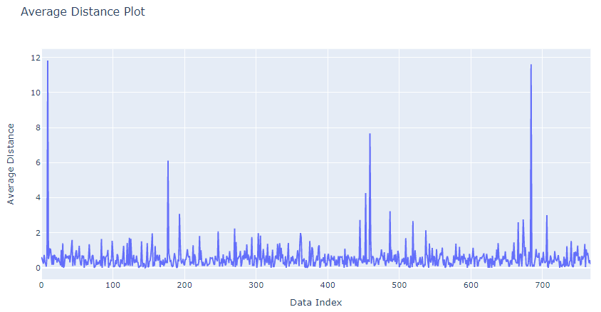
Now, we have the average distance for all the points. The data points having relatively high average distance are likely anomalous observations. We need to decide a threshold for the average distance above which we can label an observation as an anomaly. Possible candidates are [4, 6, 7, 8]. Let's select six as the threshold.
outlier_index = np.where(distances.mean(axis = 1) > 6)

outlier_values = df.iloc[outlier_index]

fig_normal = px.scatter(df, x="Age", y="BMI")
fig_outlier = px.scatter(outlier_values, x="Age", y="BMI")

fig_outlier.update_traces(marker=dict(size=12,
                              line=dict(width=2,
                              color='Red')),
                  selector=dict(mode='markers'))

fig = go.Figure(data=fig_outlier.data + fig_normal.data)
fig.update_xaxes(title_text='Age')
fig.update_yaxes(title_text='BMI')
fig.show()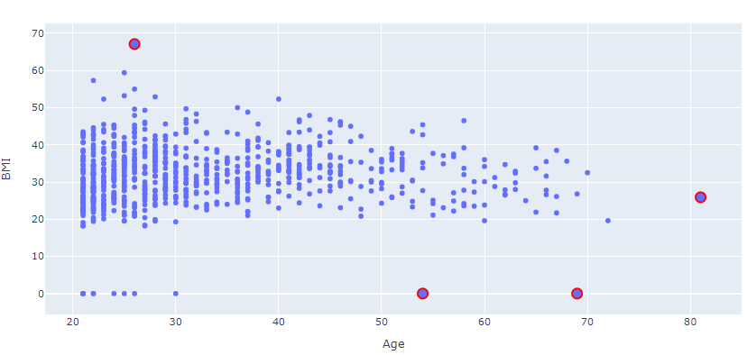
The above plot does make sense here:
- A person with an age greater than 50 can't have a 0 BMI.
- A person aged between 20 to 30 is less likely to have a BMI of 70.
Let's take a look at the pros and cons of using KNN:
Pros:
- Applicable to both univariate and multivariate datasets
- Captures complex anomalies
- Simple and explainable
Cons:
- Not applicable to categorical variables (Can try hot-encoding to apply)
- High storage requirement
- Computationally expensive
Single Class SVM
SVM is generally used for both Classification & Regression tasks. However, the single-class SVM variant is designed for semi-supervised and supervised learning tasks. If you're unaware of how SVM works, refer to this blog for a concrete understanding.
One-Class SVM is identical to the SVM, but instead of finding a hyperplane to split the two classes, it utilizes a hypersphere to cover most samples. The concept of maximum margin even applies to single class SVM. Here, it refers to the maximum possible margin outside of the hypersphere. This indicates the smallest hypersphere that covers most of the observations. Any observation outside this sphere indicates an outlier value.
Let's implement single class SVM:
import pandas as pd
import matplotlib.pyplot as plt
from sklearn.svm import OneClassSVM
iris_data = pd.read_csv('iris.csv')
df = iris_data[['Sepal Length', 'Sepal Width']]

x = df.values

svm = OneClassSVM(kernel='rbf', gamma=0.3, nu=0.05)
svm.fit(x)

pred = svm.predict(x)
anom_index = where(pred==-1)

values = x[anom_index]

plt.scatter(x[:,0], x[:,1])
plt.scatter(values[:,0], values[:,1], color='r', marker ="^")
plt.xlabel('Sepal Length')
plt.ylabel('Sepal Width')
plt.show()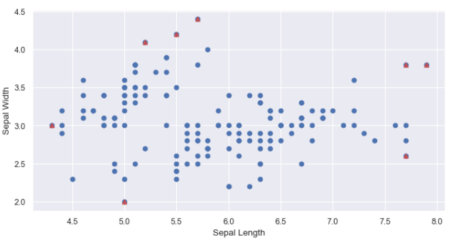
Let's take a look at the pros and cons of using Single Class SVM:
Pros:
- Applicable to both univariate and multivariate datasets
- Captures complex anomalies
- Computationally expensive
Cons:
- Not applicable to categorical variables (Can try hot-encoding to apply)
- Not suitable for large datasets
Industrial Use Cases
Let's look at some industrial use cases of Outlier Detection:
Citi Corp
Citi Corp has a dedicated team of fraud strategy analysts to prevent fraudulent activities by investigating the transactions for possible frauds. Outlier Detection algorithms are extensively used in this domain and, therefore, help in preventing fraud transactions.
Kaiser Permanente
Kaiser Permanente is a US-based medical insurance company focused on the healthcare sector. Kaiser's data scientists use statistical models for anomaly detection and medical analysis. Finding anomalies in the medical report is often required to provide life-saving treatments, and hence, the model should be fast and precise.
AccuWeather
AccuWeather relies on anomaly detection models for finding the anomalies in weather data. This helps indicate the possibilities of natural calamities like tsunamis, tornados, and whirlpools. Reporting such calamities in advance can save lives.
Interview Questions
If we apply for Data Science or Data Analytics positions, we should be aware of the anomaly detection techniques. Possible interview questions on this topic can be:
- What are outliers or anomalies, and how can you say a particular sample belongs to the anomaly class?
- What are the techniques used to detect the anomalies present in the data?
- What are quartiles, and what is the IQR technique?
- How does single-class SVM help in anomaly detection?
- Which industries have the direct use case of anomaly detection?
Conclusion
We started with a brief introduction to anomalies and answered why finding anomalies is crucial for us. We looked at different anomaly detection algorithms and dealt with the pros and cons of each algorithm. Moving onwards, we looked at some industrial applications of anomaly detection and concluded the session with the interview questions. I hope you enjoyed it!
Enjoy learning, Enjoy algorithms!
