Introduction to Matplotlib Library in Python
Data Visualization is the key to understanding complex patterns in the data. It helps reveal underlying hidden trends and patterns in data so that the end-users, including data scientists or analysts, make an informed decision based on it. Matplotlib is one of Python's most effective visualization libraries for data visualization.
In this blog, we will introduce Matplotlib for data visualization; we will cover its installation, various types of graph plotting using Matplotlib, and finally, we will conclude with its advantages and limitations.
Key Takeaways from this blog
After going through this blog, we will be able to understand the following things:
- What is Matplotlib?
- Installation of Matplotlib library using PIP.
- What is Pyplot in Matplotlib?
- The subplot in Matplotlib's pyplot module.
- Various plots using Matplotlib.
Let's start with knowing the overview of this library first.
What is Matplotlib?
Matplotlib is an open-source data visualization and graph plotting library built over NumPy arrays. John Hunter presented it in the year 2002. It is a two-dimensional visualization library, but some extensions also allow it to plot three-dimensional graphs. It provides several plotting functions to modify and fine-tune the graphs. Additionally, it supports various plots like scatter-plot, bar charts, histograms, box plots, line charts, pie charts, etc. But before moving toward these plots, let's discuss the installation of this library onto our systems.
How to Install Matplotlib in Python?
We can install Matplotlib using the following pip command in Python:
pip install matplotlib
In a conda environment, the following command will work:
conda install matplotlib
We can import it using the following command:
import matplotlib # importing Matplotlib

print(matplotlib.__version__) # Prints the matplotlib version
Now that we have Matplotlib installed, we can start discussing the essential modules and concepts. Firstly, we will begin with the pyplot module.
What is Pyplot in Matplotlib?
Pyplot is a module of Matplotlib, a collection of functions used for modifying the figure: e.g., creates a figure, creates a plotting area, creates labels for plot decorations, etc. Let's plot a simple line using the pyplot module:
import matplotlib.pyplot as plt #reduced the name of pyplot to plt

plt.plot([1, 4, 9, 16, 25, 36, 49, 64]) # Plotting to the canvas

plt.title('Square of Numbers') # Creating a title

plt.show() # Shows what we are plotting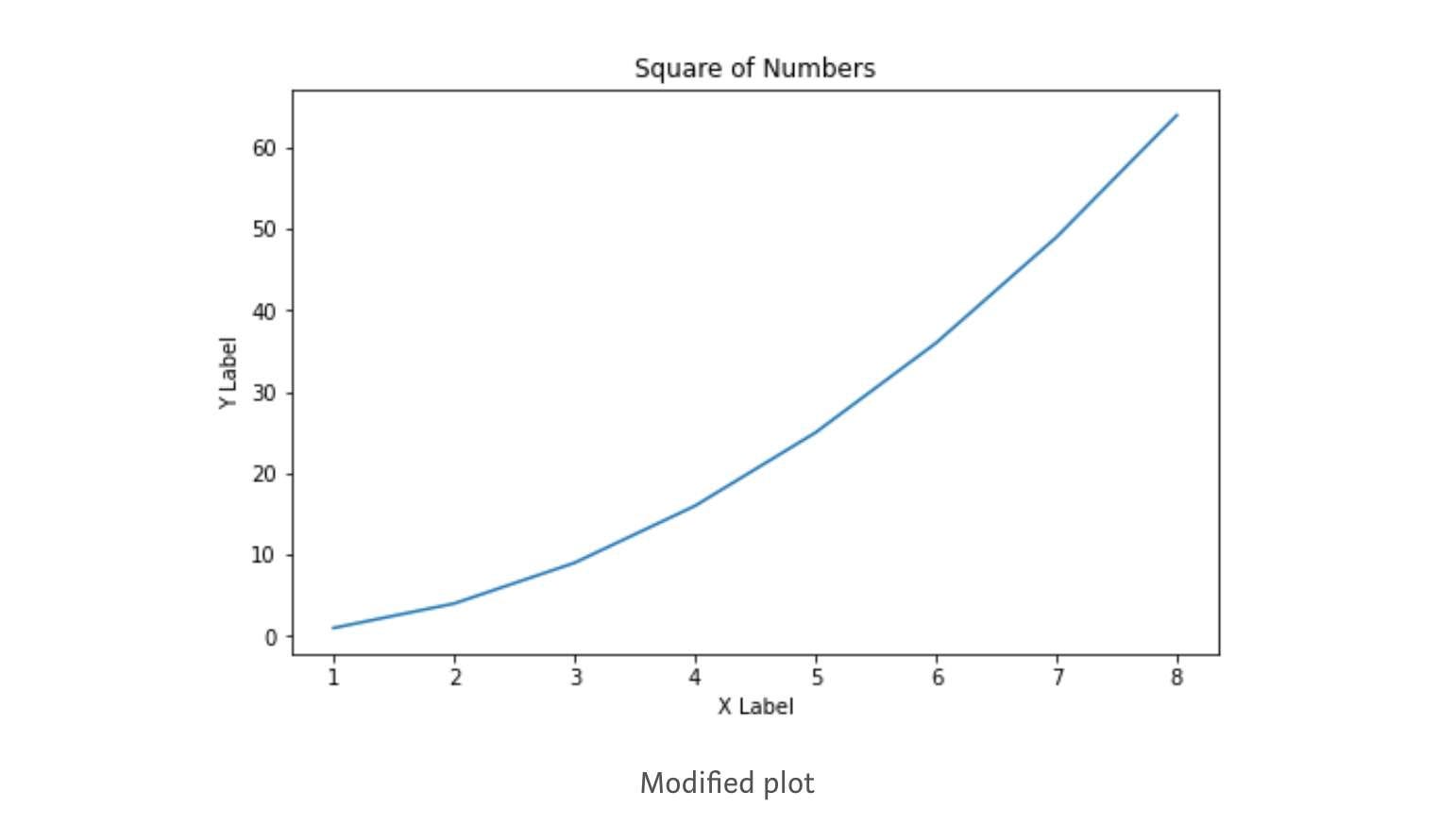
We can add more details by creating a label for the x-axis & y-axis and can also control the figure size. Let's create another visualization and implement the same:
import matplotlib.pyplot as plt

# defining a number array
x = [1, 2, 3, 4, 5, 6, 7, 8]

# performing a square operation on x array
y = [o*o for o in x]

# controlling the figure size
plt.figure(figsize=(8,5))

# plotting the graph over canvas
plt.plot(x, y)

# creating a title for the plot
plt.title('Square of Numbers')

# creating a label for x & y axis
plt.xlabel('X Label')
plt.ylabel('Y Label')

# showing what we plotted
plt.show()
Now, we are good enough with the pyplot module, and we can start exploring the subplot function of the pyplot module.
What is Subplot in Matplotlib's pyplot module?
The subplot is a function in the pyplot module frequently used for plotting multiple plots in the same figure at a time. The subplot function takes three parameters in its layout. The first and second parameters represent the number of rows & columns, and the third represents the current plot index. Let's understand with an example:
import matplotlib.pyplot as plt

x = [1, 2, 3, 4, 5, 6, 7, 8]
y = [o*o for o in x]

plt.subplot(1,2,1)
plt.plot(x, y, color='blue')

plt.subplot(1,2,2)
plt.plot(x, y, color='green')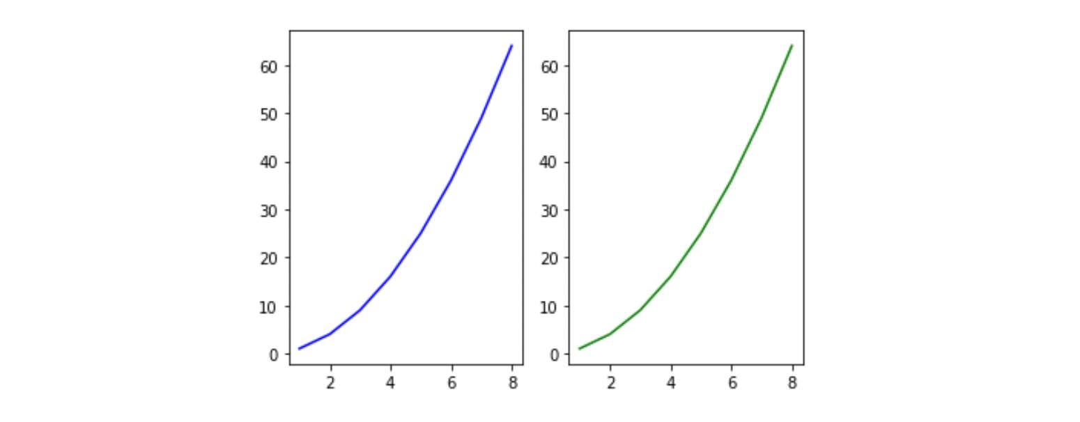
Subplot(1, 2, 1): It says the figure has space divided into one row and two columns, and this is the first plot of the series. In this case, the plots are created side by side horizontally.
import matplotlib.pyplot as plt

x = [1, 2, 3, 4, 5, 6, 7, 8]
y = [o*o for o in x]

plt.subplot(2,1,1)
plt.plot(x, y, color='blue')

plt.subplot(2,1,2)
plt.plot(x, y, color='green')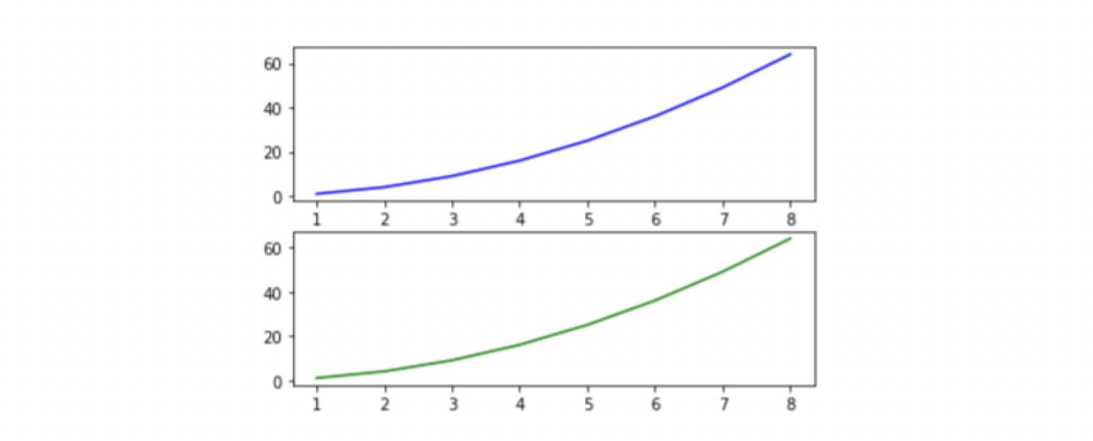
Subplot(2, 1, 1): It says the figure has space divided into two rows and one column, and this is the first plot of the series. In this case, the plots are created vertically stacked over each other.
Now, we are ready to explore the Matplotlib library for data visualization in Python.
Data Visualization using Matplotlib
We will explore the plots based on their data type. We have different plots for continuous, categorical, and mixed variables. In this session, we will cover the following plots using the Matplotlib library, their syntax, and when we should use which plot:
- Histogram
- Line Plot
- Bar Chart
- Pie charts
- Scatter plot
- Boxplot
Histogram
Histograms are frequently used in the visualization of univariate data as a sequence of the bar. We first need to create bins from the overall range to create a histogram. This will divide the overall range into equal parts called bins. Then, we will count the values in each interval. The height of the bar represents the frequency of values falling into the corresponding interval. We can use plt.hist() function for plotting the histogram. Let's take a look at the syntax:
#The syntax for Histogram:

matplotlib.pyplot.hist(x, bins=None, range=None,
                       density=False, weights=None,
                       cumulative=False, bottom=None,
                       histtype='bar', align='mid',
                       orientation='vertical',
                       rwidth=None, log=False,
                       color=None, label=None,
                       stacked=False, *, data=None, **kwargs)
List of essential parameters:
- x: The input values for the histogram take either a single array or a sequence of arrays.
- bins: It is generally an integer value; it defines the number of equal-width bins in the range. If an integer sequence is provided, bins will be unequally spaced, covering the width of the bin from left to right.
- range: lower and upper range of the bins.
- density: returns a probability density curve based on bin count.
- hisstyle: Optional parameter to modify the type of histogram: 'bar,' 'bar stacked,' 'step,' 'step filled.'
Let's implement a histogram using Matplotlib on randomly generated data through a uniform distribution:
import numpy as np

#draw random samples from random distributions.
x = np.random.normal(1, 100, 300)
plt.figure(figsize=(8,5))

#plot histograms
plt.hist(x)
plt.title('Histogram')
plt.xlabel('Values')
plt.ylabel('Density')
plt.show()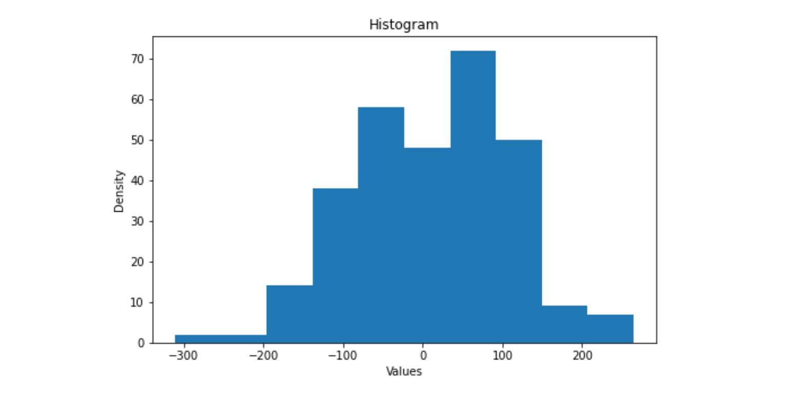
Line Plot
A line plot is used to visualize the relationship between the x and y-axis. It is also used for visualizing the time series trend line in Python. The plot() function in Matplotlib is used to plot the x and y coordinates.
#The syntax for line plot:

matplotlib.pyplot.plot(*args, scalex=True, scaley=True,
                       data=None, **kwargs)
List of essential parameters:
- x, y: Input for the line plot, expected to be an array.
- scalex, scaley: Determines the view limit to be adopted, expects bool.
- data: An object with labeled data. It provides the label names to plot in x and y.
Let's implement the line plot in Matplotlib:
x = np.linspace(0, 20, 200)
plt.plot(x, np.sin(x), '-',color='blue')
plt.xlabel('Time in Seconds (s)')
plt.ylabel('Sinusoid Output')
plt.title("Sinusoid Wave")
plt.show()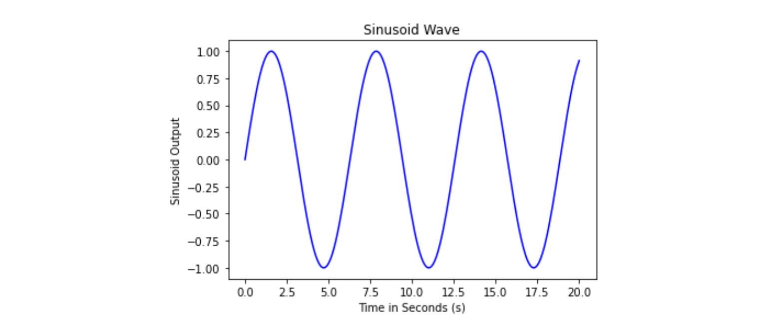
Bar Chart
Bar Charts primarily represent categorical data with rectangular bars with height proportional to their values. One axis of the bar chart represents the category, and another axis represents the values.
# Syntax for Bar Chart
matplotlib.pyplot.bar(x, height, width=0.8, bottom=None,
                      *, align='center', data=None)
List of essential parameters:
- x: represents the x coordinates of the bar.
- height: heights of the bar, expects an array as input.
- width: determines the width of the bars, and the default value is 0.8.
- bottom: determines the y-coordinate of the bar.
- align: determines the alignment of the plot.
Let's implement Bar Chart using Matplotlib:
course_marks = {'Maths':80, 'Science':65, 'English':70, 'Arts':50}
courses = list(course_marks.keys())
values = list(course_marks.values())

fig = plt.figure(figsize = (12, 7))

# creating the bar plot
plt.bar(courses, values, color ='grey', width = 0.6)

plt.xlabel("Courses")
plt.ylabel("Students Enrolled")
plt.title("Students enrolled in different courses")
plt.show()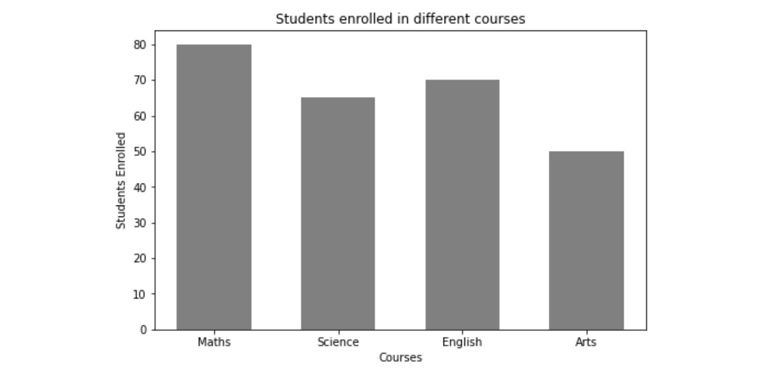
Pie Chart
The Pie Chart is used to visualize the univariate data that describes the data in a circular diagram. Each pie chart slice corresponds to a relative portion of the category against the entire group. We can plot a pie chart using the plt.pie() function.
# Syntax for Pie Chart
matplotlib.pyplot.pie(x, explode=None, labels=None,
                      colors=None, autopct=None,
                      pctdistance=0.6, shadow=False,
                      labeldistance=1.1, startangle=0,
                      radius=1, counterclock=True,
                      wedgeprops=None, textprops=None,
                      center=(0, 0), frame=False,
                      rotatelabels=False, *, normalize=True,
                      data=None)
List of essential parameters:
- x: Input values, expects an array of values
- labels: Input labels; expects an array of string
- Autopct: It's a parameter that labels the wedges with their numeric value. The labels are placed inside the wedge or slice.
Let's implement Pie Chart:
import matplotlib.pyplot as plt

plt.figure(figsize=(7,7))
x = [67, 33]

#labels of the pie chart
labels = ['Water', 'Land']

plt.pie(x, labels=labels)
plt.show()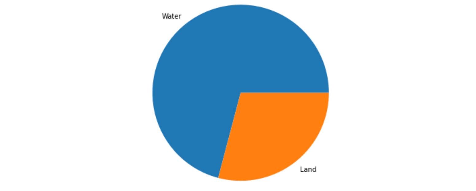
Scatter Plot
Scatter plots are used to visualize the relationship between two variables. It is frequently used in Bi-variate analysis where both features are continuous. It simply represents the data in a two-dimensional plane. The scatter() function of Matplotlib is used to draw a scatter plot.
# Syntax for Scatter Plot
matplotlib.pyplot.scatter(x, y, s=None, c=None, marker=None,
                          cmap=None, norm=None, vmin=None,
                          vmax=None, alpha=None,
                          linewidths=None, *, edgecolors=None,
                          plotnonfinite=False, data=None)
List of essential parameters:
- x, y: Input data value
- s: Controls the marker size
- c: A marker for colors
- norm: Normalizes data
Let's implement Scatter Plot:
import random
import matplotlib.pyplot as plt

x = random.sample(range(10, 50), 40)
y = random.sample(range(20, 80), 40)

plt.scatter(x, y)
plt.xlabel('Feature 1')
plt.ylabel('Feature 2')
plt.title('Scatter Plot')
plt.show()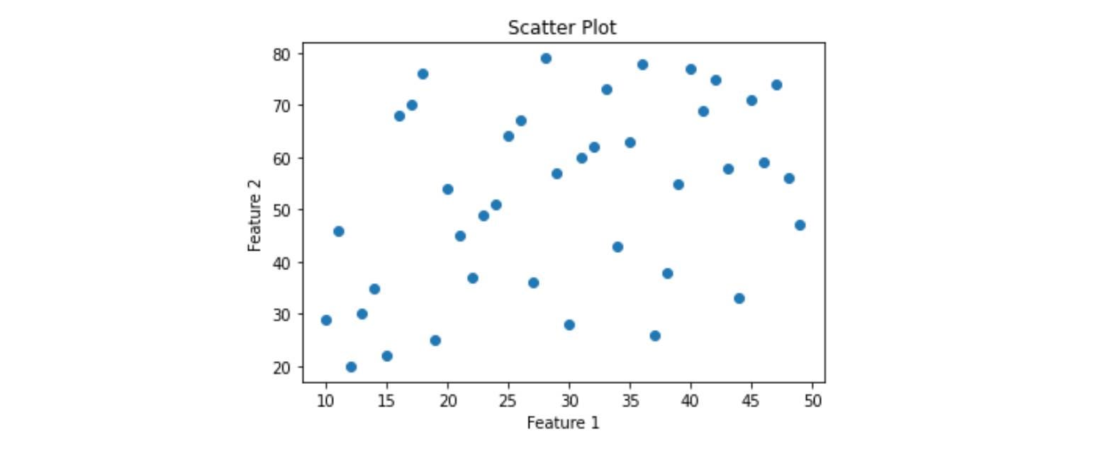
Box Plot
Box plots are to show summary statistics of numeric features in the dataset. The summary contains the minimum, first quartile, second quartile(median), third quartile, and maximum.
# Syntax for Box plot
matplotlib.pyplot.boxplot(x, notch=None, sym=None,
                          vert=None, whis=None, positions=None,
                          widths=None, patch_artist=None,
                          bootstrap=None, usermedians=None,
                          conf_intervals=None, meanline=None,
                          showmeans=None, showcaps=None,
                          showbox=None)
List of essential parameters:
- x: Input data
- notch: determines whether to draw a notched box plot or rectangular boxplot
- vert: If true, draws vertical boxes; if false, draw horizontal boxes.
Let's implement Box Plot:
import random
import matplotlib.pyplot as plt

x = np.random.normal(100, 20, 300)
plt.boxplot(x, patch_artist=True, vert=True)
plt.ylabel('Values')
plt.show()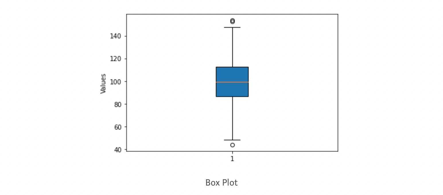
With boxplot, we finished our basic tutorial to the Matplotlib library. Let's look at some advantages and limitations of Matplotlib.
What are some advantages and disadvantages of Matplotlib?
Matplotlib is one of Python's most potent visualization libraries but has some shortcomings.
Following are some limitations of Matplotlib:
- It works well with arrays but is unsuitable for data frames since it does not offer explicit functions that allow straightforward data frame data plotting, unlike the seaborn library.
- It lacks custom themes and color pallets, making its plot unappealing.
- It is not recommended for time series data visualization.
Following are some advantages of Matplotlib:
- It supports various kinds of graphs like Bar, Histograms, Line-plots, Scatters-plots, etc.
- It can be used and accessed through Python Scripts, iPython Shells, and Jupyter Notebook.
- Matplotlib is a two-dimensional library, but some extensions allow us to create three-dimensional plots.
Conclusion
In this article, we provide a brief introduction to the Matplotlib library in Python. We covered the installation of Matplotlib in Python and the most fundamental pyplot module of Matplotlib. Further, we learned about subplots, frequently used for plotting multiple plots in a single figure. We started with various data visualization functions, syntax, and implementation in Python. Finally, we concluded the session with the limitations and advantages of Matplotlib. We hope you enjoyed this article.
Enjoy Learning!
Share Your Insights
More from EnjoyAlgorithms
Self-paced Courses and Blogs
Coding Interview
OOP Concepts
Our Newsletter
Subscribe to get well designed content on data structure and algorithms, machine learning, system design, object orientd programming and math.
©2023 Code Algorithms Pvt. Ltd.
All rights reserved.
